


Accuracy vs Atmosphere: Interior Lessons from Wuthering Heights
The latest adaptation of Wuthering Heights has sparked online conversation, largely due to its unapologetically era-blending costumes. The result has divided opinion (understatement alert!). But beyond the debate, it raises an interesting design question. What happens when we stop trying to perfectly recreate the past, and instead reinterpret it? In this month’s edit, I’m exploring what that creative collision can teach us about interiors… and why blending eras can feel far more compelling than following one!
Accuracy vs Atmosphere: What's the Issue?
A lot of the criticism around this movie has centred on historical accuracy. The costumes (designed by Jacqueline Durran)don’t sit neatly in one era.

You’ll see Victorian silhouettes in glossy, almost modern fabrics. Tudor and Georgian references layered with 1950s glamour. Dramatic capes, gothic crosses, exaggerated detail. It’s theatrical, sometimes intentionally artificial…

My opinion? That’s exactly the point. The film isn’t trying to perfectly recreate 1847. It’s trying to heighten the feeling of the story. The mood comes first.
The timeline comes second.

It got me thinking about how we approach interiors….and how often we pigeonhole ourselves into neat categories. “Victorian.” “Mid-century.” “Traditional.” As though a room has to declare its allegiance to one specific moment in time.
But the most interesting spaces rarely do. They borrow, layer and reinterpret. And when that blending is intentional, it doesn’t feel confused at all - but considered!
Lesson One: Feeling First

When you walk into a room, you don’t register the era before anything else. You register the atmosphere. Is it moody? Calm? Romantic? Dramatic?
That’s what this adaptation understands. The silhouettes might nod to history, but the emotion is unmistakably heightened. The story leads.
Interiors should work the same way. Instead of asking, Is this strictly Victorian? or Does this feel mid-century enough? perhaps the better question is: What do I want this room to feel like?
Once the feeling is clear, you can pull references from wherever they serve that mood.
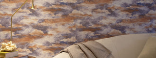
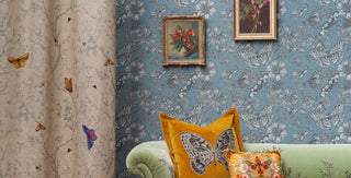
Her black gown is nothing short of commanding, sculpted in luminous satin, its sweeping skirt and structured bodice evoke a grandeur that feels both aristocratic and theatrical. The depth of the fabric catches the light like polished onyx, while the restrained palette heightens every contour, every movement, every pause. It is drama rendered in silhouette.
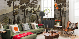
Similar to this black-and-white opulence, we selected the recommended wallpapers below, an understated yet powerful backdrop that makes its statement not through pattern, but through sheer presence and tactile richness. In its subtle texture and tonal depth, it mirrors the gown’s quiet authority.


Lesson Two: Testing Tension
The reason these costumes are sparking debate is because they’re unexpected. A traditional shape in a glossy modern fabric. A historically grounded cape exaggerated to theatrical proportions. It creates tension.
And tension is what makes something memorable.
In interiors, that might look like a heritage floral wallpaper paired with contemporary lighting. Or antique-inspired motifs scaled up dramatically in a modern apartment.


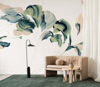
The pink gowns are a study in romantic opulence, layers of diaphanous tulle washed in blush and rose, adorned with delicate florals that feel both painterly and ethereal. One evokes a garden in bloom with embroidered petals climbing across ivory, while the other glows in soft ombré hues, as though lit by dusk. There is movement in every fold, a lightness that contrasts beautifully with the weight of their setting.
To echo this poetic femininity, we selected the recommended wallpaper in florals and nuanced pinks - an enveloping backdrop that extends the narrative beyond fashion and into the room itself. The blossoms on the wall do not compete; they converse, deepening the atmosphere with texture and tonal layering.


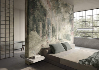
Lesson Three: Reinterpret, Don’t Replicate
There’s a difference between inspiration and imitation.
Recreating a period room exactly as it once existed can feel staged. But reinterpreting elements of the past (adjusting scale, shifting color, modernizing material) allows history to feel alive rather than preserved.
That’s what this film does so confidently. It respects its references, but it isn’t ruled by them.
Our interiors can do the same.

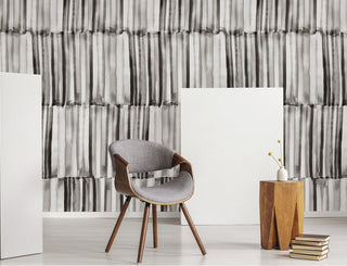
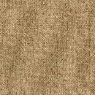
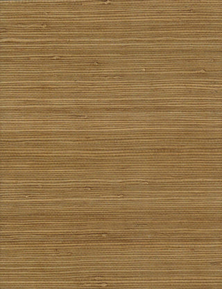
Her gown is a vision in ivory structured through the corseted bodice yet softened by sheer, airy sleeves that catch the light with a whisper of romance. The delicacy of the fabric feels almost weightless, while the silhouette remains unmistakably historical. Then, the unexpected: a sweeping grasscloth hat, sculptural and organic, grounding the look with texture and quiet audacity.
We selected the recommended products in refined grasscloth and whisper-light textiles, surfaces that mirror the gown’s translucence while introducing tactile depth. The natural weave brings an earthy modernity.


In the end, the controversy around Wuthering Heights isn’t about costumes: it’s about expectation. We’ve grown comfortable with history presented as polished, precise, and predictable. But the most compelling design, on screen or on our walls, doesn’t play it safe. It reimagines, it provokes, and in doing so, it makes the past feel powerfully alive.
Enjoy this? For more ideas, insights and inspiration, explore Maria’s Edit today.