| Styling with patterned material can be a tricky business. A mix and match, when done well, has the power to transform a space into a patterned paradise. But when done wrong, well, let’s just say it can be jarring. To help you create the former, here are our styling 5 tips, using beautiful pattern fabrics and wallcoverings from House of Hackney. |
1. Palette PairingPalette pairing is one of the most common pairing techniques for coordinating contrasting wallpaper and fabrics. |
|
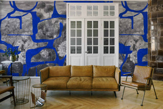
Beautiful, bold, and daunting to pair. The perfect challenge! This design provides a symphony of pairing opportunities, you just need to know where to start. For palette pairing, you should select a single color from the design, and then select a pairing that features the same color. That way, you can coordinate contrasting patterns to perfection. |
| Top tip: We recommend you start by considering the intentions of the space. Is it a soothing relaxation space? If so, choose a wallpaper that matches the royal blue or black in the design. For a bustling family space, use yellow or orange to inject positive energy. |
2. Block to add balanceIf you’ve chosen a bold pattern that you want to include as a feature, you may prefer to pair with a block, neutral color to balance the space. For this styling tip, we’re using Golden Lily Apatite. |
| This beautiful, vibrant pattern promises to steal the show, especially when paired with block, neutral tones. As you can see, painted panelling works beautifully as a combination. |
3. Texture for True TasteTexture is a really important factor to consider when pairing your patterns. You can go bold with your wallpaper, curtains and upholstery if you balance them correctly. Allow us to demonstrate, using Phantasia Taupe. |
| This design is earthy yet otherworldly, natural yet magical. You can add patterns that pull these themes through without overpowering your space, as long as your mix up the texture. Take a look for yourself. |
| So you see, by matching the wallpaper and curtains, a subtle coherence has been created, and then the nature theme is pulled through with the contrasting woven fabric of the armchair. |
4. Furnish for fusionNot all pattern pairings need to be obvious. Sometimes, pattern-engraved furniture can be what makes the perfect coordinating combination. Let’s use Nanjizal for this styling tip. |
| This bold, beautiful design offers a pop of modern taste to a space. This is the perfect opportunity for some fashionable fusion to take place. |
| Pair the bold and modern with classic, antique hardwood furnishings. The ornate, intricate engraving of the dressing table stunningly compliments the wilder, vibrant wallpaper. And, with the final touch of whimsy with the pineapple lamp, you can finish off your patterns with a feature flourish. |
5. Select with ScalesLast but certainly not least, we have the scaling technique. Perfect for those who love to incorporate multiple patterns into one place, scaling works by prioritising design and styling around a single pattern. Allow us to explain, using Blackthorn Tourmaline. |
|
Notice how the blind uses the same nature theme, but with a less busy pattern? And how do the tiles pull through the same color palette in a block motif? That right there, is how you select with scales.
Did you know, you can filter our collections by style? This way, you can pair patterns with ease. Explore now. |
| So, this is our primary design. The challenge now, is to scale back your next pattern selections, pulling a single element from this design. This could be a less busy design with the same theme, or a pattern that uses the same color – or both! |


