


Lately, I’ve been thinking about how much fashion and interiors are starting to speak the same language. As we move toward 2026, there’s a noticeable softening in both; a pull toward calm, clarity, and designs that feel considered rather than constructed. So, from Pantone’s color of the year, to TikTok fashion trends, I’ve decided to explore how our must-have wardrobe fillers can translate to our walls and interiors.
Cloud Dancer: Making Space for Lightness
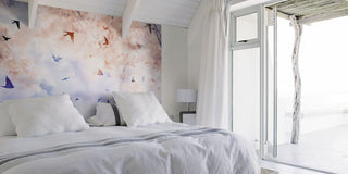
Pantone’s Color of the Year, Cloud Dancer, is quite literally, a breath of fresh air. A tone that balances function and feeling, this shade welcomes visual calm while still feeling warm and human. To me, this sentiment instantly whispers minimalism.

Too often, I see people thinking minimalism = cold whites and empty spaces. But really, it’s about creating clarity - not erasing warmth!
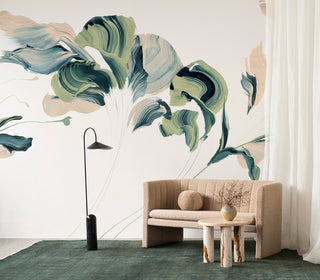
In interiors, it’s all about giving the eye space to rest. And shades like Cloud Dancer can work as a gentle foundation, reducing visual noise and allowing form, texture, and proportion to take the lead. It naturally encourages thoughtful layering, giving space for fewer elements, chosen with intention.
When done right, the space will feel more livable. It supports a sense of ease, lightness, and well-being. Cloud Dancer sets the tone for homes that feel calm, considered, and restorative….which is exactly the energy 2026 needs!


Design by drenching
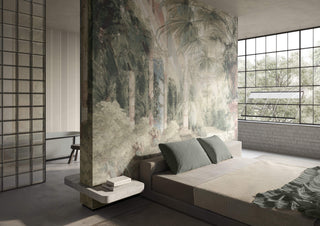
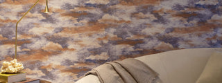
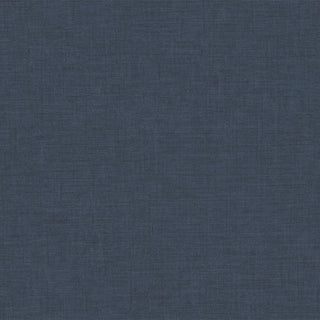
Color drenching has become a recurring theme in fashion; making a commitment to one shade and exploring variation through texture, finish, and material instead. It’s a styling choice that feels confident and intentional. And personally, I’m loving the way this has shifted towards deeper neutrals.


Navy and camel are emerging as key tones…both grounded, both versatile, and far more expressive than they first appear.
This can translate beautifully into interiors; creating atmosphere without relying on color for contrast.
The challenge is to create interest from how light interacts with surfaces, and how different textures sit alongside one another.
Matte against subtle sheen…smooth surfaces alongside woven or tactile ones. You’ll be surprised by the results this trend can unlock!
Navy


Camel


TikTok’s Take on 2026
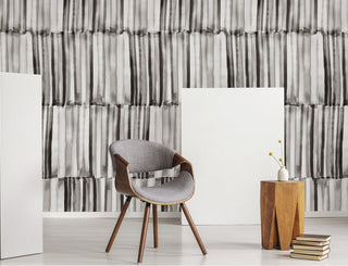
TikTok trends seem to leave as swiftly as they arrive…but one I hope sticks around is the rise of oversized, floor-length silhouettes. Coats that drape, wrap, and move slowly; designed for comfort as much as impact.


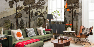
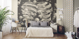
I love the thought of translating this trend into interiors…it’s an opportunity to write a story about proportion.
Fewer breaks, longer lines, and a sense of continuity. It’s about allowing elements to flow, whether through uninterrupted surfaces, extended wallcoverings that flow with the structure, or design choices that feel expansive rather than busy.

When done right, you’re left with a space that feels calmer, more grounded, and less visually demanding.

The overarching message of 2026 fashion seems to be less is more, a shift toward intention and feeling rather than noise and excess. To me, it’s an invitation to try choosing fewer elements, but choosing them well, allowing proportion, texture, and tone to carry the design. From wardrobe to walls…this is my take! For more inspiration, picks, tips and more, explore my full edit.