










The Front Row Palette: SS27's Five Colors, Off the Runway and Onto the Wall
Every September, four cities shape the palettes the world will be wearing eighteen months from now. New York opens (Sept 11–16), then London (17–21), Milan (23–29), and Paris (28–Oct 6), each sending Spring/Summer 2027 down the runway — and the forecast mood is a decisive turn. Five shades are tipped to lead the charge: Cobalt Blue, Satsuma, Rose Blush, Meadow Green, and Terracotta Pot…and we have a feeling each has the potential to extend past fashion and into interiors. So, here’s how we see these five emerging colors, off the runway and onto the wall.
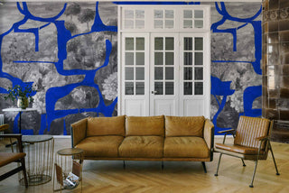
Cobalt Blue: The Confidence Color
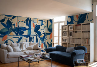
If cobalt is the season's power shade on the body, it's an even better one on the wall. A saturated jewel blue is simply the fastest way to give a room conviction — it reads as a decision, not a default. The trick is restraint of surface: one bold wall will always beat a whole bold room, so let cobalt claim a single plane and stop there.


It's happiest somewhere with a bit of drama to justify it — a study, a dining room, a feature wall behind a bed — and it flatters anything warm and burnished, so pair it with brass, gold, honeyed timber, or a soft cream to keep it from turning cold.
Satsuma: New Retro Energy


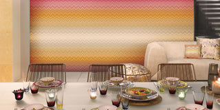
Satsuma is the season's live wire — a vivid orange powering the "New Retro" mood, all seventies revival and good humor. But orange is an energizer, not a whole-room commitment. Used everywhere it exhausts; used where you want a jolt of movement, it's unbeatable. Think hallways, a creative corner, or the downstairs powder rooms…spaces that could do with a bit of vavavoom.


The secret to keeping it chic rather than kitsch is company: orange sits beautifully beside warm neutrals and natural wood, which ground its energy and stop it tipping into novelty.


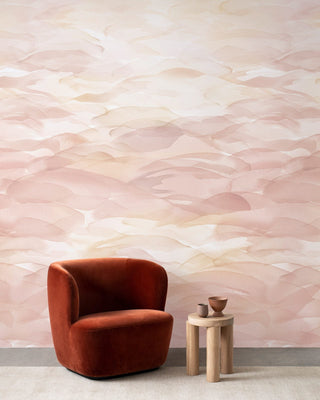
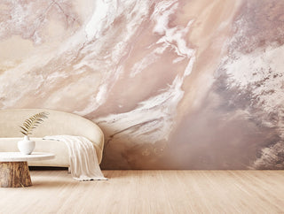
Rose Blush: The Return of Elegance
For every bold shade, the season offers a soft counterpoint — and blush is it. This is not the sugary pink of a decade ago but a grown-up, dusky version that behaves like a warm neutral.

Meadow Green: The New Neutral
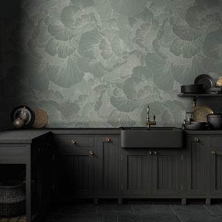
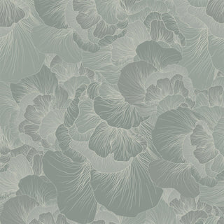
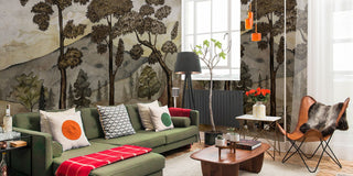
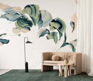
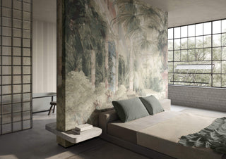
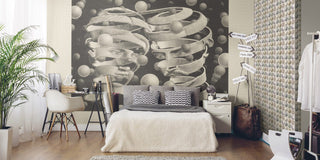
Here's the season's quiet radical: a nature-led green the forecast frames not as an accent but as a neutral — a shade you can build an entire room around. Green grounds a space the way few colors can, doing all the biophilic work of connecting an interior to the world outside. It reads as restful, which is exactly why it earns its keep across whole rooms rather than a lone accent wall.
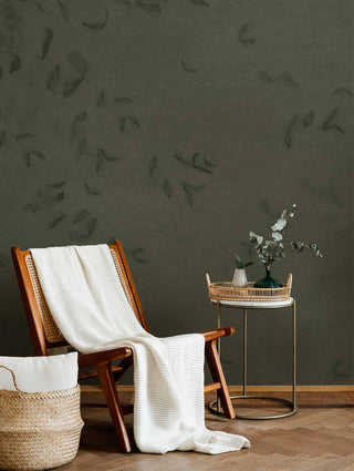

How you deploy it sets the mood. A large-scale botanical will bring energy and depth, where a flat, soft sage will simply calm — so choose your register.
Terracotta Pot: Luxe-Natural Warmth
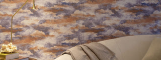
If cobalt is confidence and blush is calm, terracotta is the season's grounding note — the earth tone anchoring its "Luxe-Natural" aesthetic.


How you deploy it sets the mood. A large-scale botanical will bring energy and depth, where a flat, soft sage will simply calm — so choose your register.
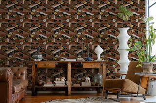
The one rule: texture sells this shade in a way a flat print never will. A tactile finish is what makes terracotta feel like a hand-thrown pot rather than a paint chip.
The Takeaway
Five shades, five moods — but the real lesson is older than any season. Trends tell you what; you decide how; discover your next palette at NewWall, today.
Read more of What's Trending at NewWall.